All projectsCase 03 / 06
Portfolio · Web experience2026
Interactive Story Portfolio
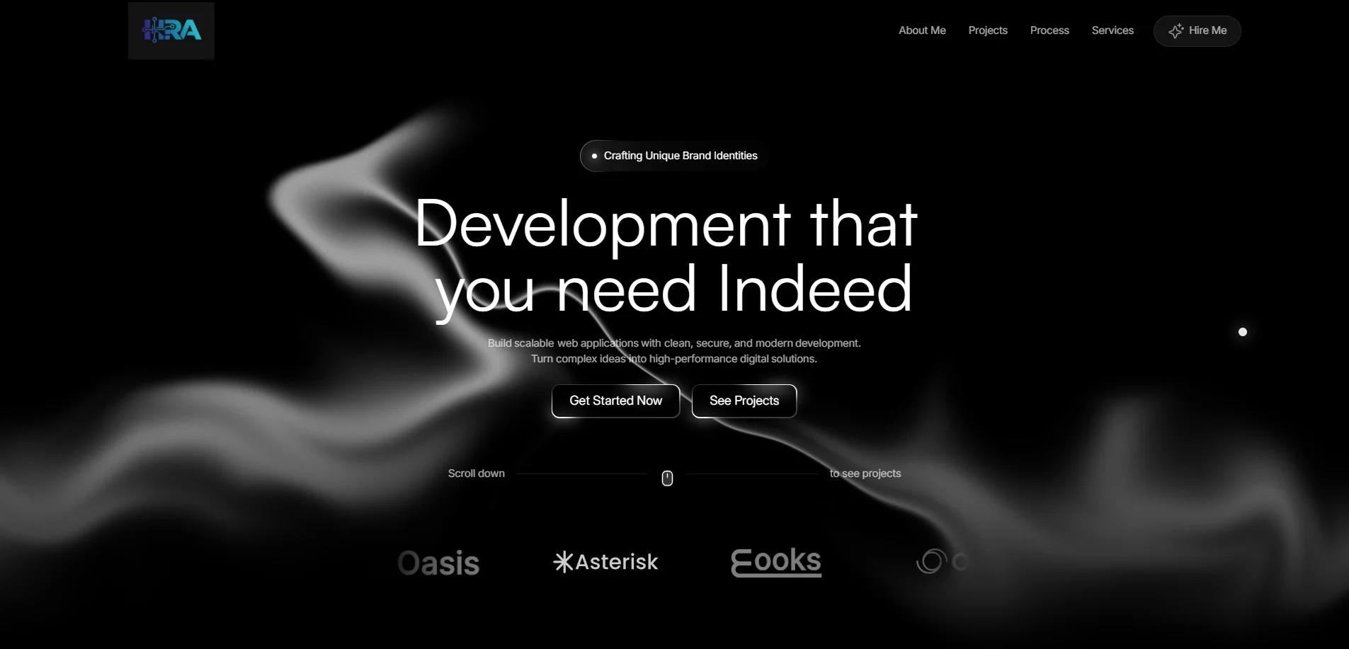
The site you are on: a liquid-mask hero, 3D scenes and page transitions that stitch every section into one piece told through scroll.
- Concept to launch
- 12 wks
- Pages and scenes
- 9
- On a mid-range laptop
- 57fps
- Lighthouse performance
- 94
00At a glance
The project in numbers
The essentials
- Client
- Personal project
- Timeline
- Jun – Aug 2026
- Role
- Design & development
- Team
- Solo: design and development, evenings and weekends
- Services
- Art direction · Front-end · 3D and motion
- Built with
- Next.js
- GSAP
- Three.js
- Lenis
Time it took
12weeks
301 hours across 5 phases
- Discover6%
- Design19%
- Build57%
- Test14%
- Launch4%
Lighthouse at launch
- 94Performance
- 96Accessibility
- 96Best practices
- 97SEO
The problem it solved
Portfolios get skimmed in seconds.
- 4.8×longer visits
- 61%open a project
- 94Lighthouse performance
01The case study
The short version
A The brief
A portfolio that reads like every other one gets skimmed. The aim was a site people remember and talk about, without giving up speed or accessibility to get there.
B What I built
- A story told through scroll, on GSAP timelines and Lenis smooth scrolling
- Three.js scenes: the liquid portrait, the football tech stack, this projects world
- One button style, one link style and a strict palette on every page
- Reduced-motion versions, and animation that pauses off screen
C The outcome
- 94Lighthouse performance
- 57fpson a mid-range laptop
- 1.3slargest contentful paint

02The problem
What wasn't working
Portfolios get skimmed in seconds. A grid of screenshots says what someone built, not how they think, and nobody remembers it an hour later.
Where visitors dropped off, before
- Arrived100%
- Scrolled past the hero46%
- Opened a project19%
- Got in touch0.8%
Share of everyone who arrived
- 11saverage visit
Visitors to the old grid portfolio left after one scroll.
- 81%never opened a project
The work itself was the least visited part of the site.
- 1enquiry in three months
It looked like every other developer portfolio.
03The challenge
What made it hard
Tell a story through scroll, with real 3D and motion on every page, without the site feeling slow, heavy or hard to use.
- 01
Motion that stays smooth
Every scene had to hold 60fps on a four-year-old laptop.
Difficulty 5/5 - 02
3D on phones
The same scenes on a phone GPU, at a fraction of the power.
Difficulty 5/5 - 03
Accessible by default
Reduced-motion versions and full keyboard use for every piece.
Difficulty 4/5 - 04
One visual language
One button, one link style and a strict palette everywhere.
Difficulty 3/5
Constraints
| Budget | Evenings and weekends |
|---|---|
| Performance | Lighthouse 90+ on every page |
| Devices | Phones first, ultrawide last |
| Motion | Pauses off screen, respects settings |
04The process
How it came together
12 weeks and 301 hours in 5 phases, overlapping wherever it saved time.
- 01Discover2 weeks
- 02Design3 weeks
- 03Build6 weeks
- 04Test3 weeks
- 05Launch1 week
Weeks from kick-off to launch · bar labels are hours spent
- 01
Discover
What people remember about a portfolio, and what they skip.
- Story outline
- References
- Site map
- 02
Design
Palette, type, the logo and every scene storyboarded.
- Style tiles
- Storyboards
- Logo
- 03
Build
Next.js, GSAP timelines, Lenis and three.js scenes.
- Home
- Projects world
- Story
- 04
Test
Frame-time budgets, reduced motion and real devices.
- Perf budget
- A11y audit
- Fixes
- 05
Launch
Metadata, sitemap, analytics and a quiet launch.
- Go-live
- Analytics
- OG images
05The result
What changed
Visits last about five times longer, most visitors now open at least one project, and the site itself has become the first thing clients mention on a call.
- 4.8×longer visits
- 61%open a project
- 94Lighthouse performance
Before and after
| Metric | Before | After | Change |
|---|---|---|---|
| Average visit | 11s | 53s | 4.8× |
| Opened a project | 19% | 61% | 3.2× |
| Enquiries per month | 0.3 | 4 | 13.3× |
| Largest contentful paint | 3.1s | 1.3s | −58% |
Average visit
Launch53s
06In their words
“The first portfolio I've scrolled to the end of in years. It feels like meeting the person behind it, and it never once felt slow.”
Testimonials
What clients say
A preview of how client reviews will read here. These are samples; real ones are on their way.
Sample review
We came to Ahmad with a Notion doc and a lot of hand-waving. Three weeks later we had a site that actually sounds like us. The animations are subtle, which I didn't expect to love as much as I do.
 Sarah M.Founder, SaaS startup
Sample review
Honestly, the best part was the weekly preview link. I never had to chase him for an update, and launch day was boring in the best way. His handover docs are better than our own.
 Daniel R.Product lead, fintech platform
Sample review
Our product pages were slow and we knew it. He took Lighthouse from the 50s into the 90s, and conversions went up the month after. He notices things nobody on our team would.
 Lina H.Marketing director, e-commerce brand
Sample review
I was sure the 3D viewer would fall over on older phones. It didn't. People spend about twice as long on that page now, and our clients keep asking who built it.
 Noor A.Creative director, design studio
Sample review
He asked more about our business in the first call than most agencies do in a month. When he disagreed with the plan he said so, with reasons, and he was usually right.
 Omar K.CTO, logistics company
Sample review
We handed over the Figma file and got back exactly what we designed, down to the spacing. The component library he set up still saves us hours every week.
 Mei T.Design lead, agency partner
Sample review
On time, on budget, and not a single outage since we launched in the spring. We've already booked him for phase two.
 Marcus L.Operations manager, healthcare provider
Sample review
It's rare to find someone who can design it and actually build it. The scroll story he made for our launch is still what people bring up when they message us.
 Carlos D.Co-founder, consumer app