All projectsCase 06 / 06
Résumé · Web app2026
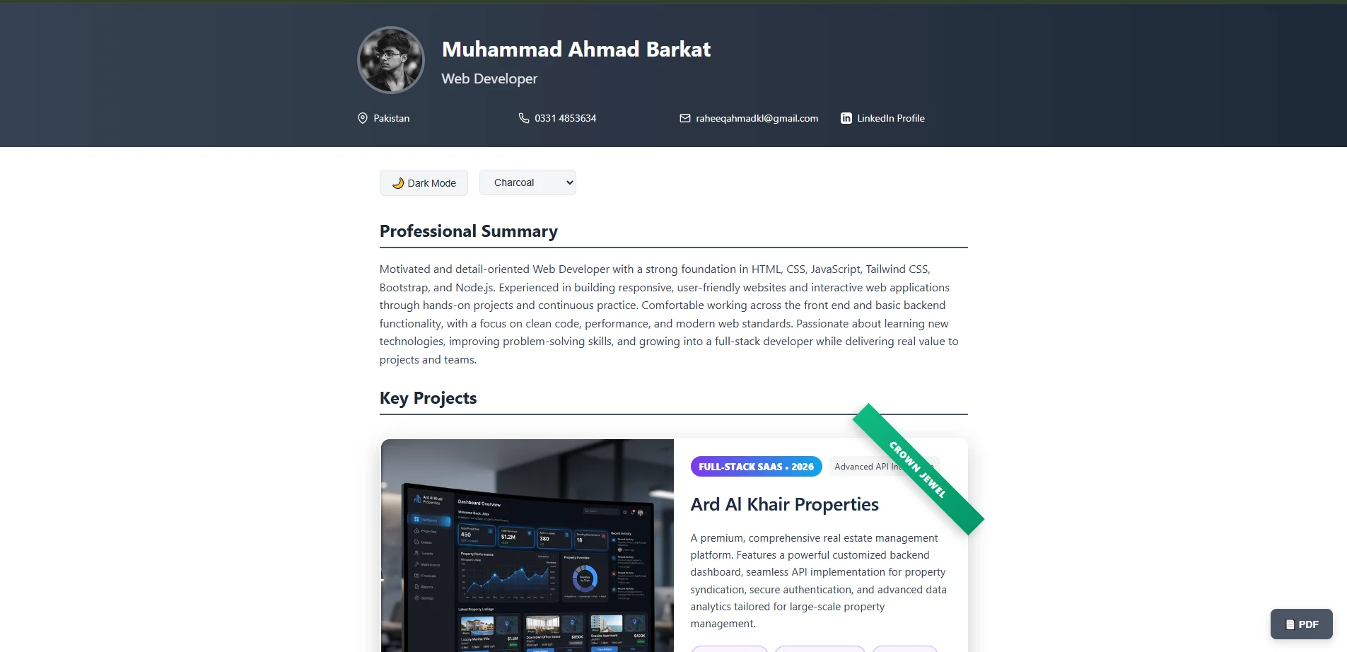
Interactive CV
A résumé that behaves like a product: light and dark themes, switchable palettes, project highlights and a one-click PDF that matches the screen.
- Concept to launch
- 3 wks
- Colour themes
- 4
- Click to a PDF
- 1
- Lighthouse performance
- 97
00At a glance
The project in numbers
The essentials
- Client
- Personal project
- Timeline
- Feb 2026
- Role
- Design & development
- Team
- Solo: design and development
- Services
- Design · Front-end · Print styles
- Built with
- HTML
- CSS
- JavaScript
Time it took
3weeks
66 hours across 5 phases
- Discover8%
- Design21%
- Build56%
- Test11%
- Launch5%
Lighthouse at launch
- 97Performance
- 95Accessibility
- 96Best practices
- 90SEO
The problem it solved
Keeping a CV current meant editing a design file, exporting a PDF and emailing it again, and the PDF never matched the website.
- 2 minper update
- 97Lighthouse performance
- 3.2×more downloads
01The case study
The short version
A The brief
A PDF résumé can't show how someone builds. The aim was a CV that is itself a small product: readable in seconds, themeable, and still one click from a clean PDF.
B What I built
- Light and dark themes with switchable colour palettes
- Project highlights laid out as cards, with the stack on each
- A print stylesheet so the PDF matches what is on screen
- Plain HTML, CSS and JavaScript, with no build step
C The outcome
- 14KBof JavaScript in total
- 96Lighthouse best practices
- 1click to a matching PDF
02The problem
What wasn't working
Keeping a CV current meant editing a design file, exporting a PDF and emailing it again, and the PDF never matched the website.
Where visitors dropped off, before
- Opened100%
- Read the summary55%
- Reached projects21%
- Downloaded4%
Share of everyone who arrived
- 3versions to keep in sync
Design file, PDF and website, always out of step.
- 40 minper update
Every small change meant a full export and re-send.
- 0interactivity
A static page with nothing to explore.
03The challenge
What made it hard
One source for the screen and the printed page, with themes, and nothing that breaks when printed.
- 01
Print that matches
The PDF had to look like the page, page breaks included.
Difficulty 4/5 - 02
Themes
Light, dark and four palettes, all readable.
Difficulty 3/5 - 03
No framework
Plain HTML, CSS and JavaScript, kept tiny.
Difficulty 2/5
Constraints
| Size | Under 50 KB of JavaScript |
|---|---|
| A4 and US Letter | |
| Themes | Contrast AA in every palette |
| Hosting | Static |
04The process
How it came together
3 weeks and 66 hours in 5 phases, overlapping wherever it saved time.
- 01Discover1 week
- 02Design1 week
- 03Build2 weeks
- 04Test1 week
- 05Launch1 week
Weeks from kick-off to launch · bar labels are hours spent
- 01
Discover
What recruiters read first, on screen and on paper.
- Content audit
- 02
Design
Layout for screen and paper at the same time.
- Layouts
- Palettes
- 03
Build
Semantic HTML, CSS variables and print styles.
- CV page
- Theme switcher
- Print CSS
- 04
Test
Browsers, printers and screen readers.
- Fixes
- 05
Launch
Published with a short link.
- Go-live
05The result
What changed
One file to edit, a PDF that always matches, and a CV that people actually play with before they read it.
- 2 minper update
- 97Lighthouse performance
- 3.2×more downloads
Before and after
| Metric | Before | After | Change |
|---|---|---|---|
| Time per update | 40min | 2min | −95% |
| Versions to maintain | 3 | 1 | −67% |
| Downloads per month | 6 | 19 | 3.2× |
Downloads per month
Launch20
06In their words
“The only CV I've ever switched to dark mode. It printed perfectly, too, which is rarer than it should be.”
Testimonials
What clients say
A preview of how client reviews will read here. These are samples; real ones are on their way.
Sample review
We came to Ahmad with a Notion doc and a lot of hand-waving. Three weeks later we had a site that actually sounds like us. The animations are subtle, which I didn't expect to love as much as I do.
 Sarah M.Founder, SaaS startup
Sample review
Honestly, the best part was the weekly preview link. I never had to chase him for an update, and launch day was boring in the best way. His handover docs are better than our own.
 Daniel R.Product lead, fintech platform
Sample review
Our product pages were slow and we knew it. He took Lighthouse from the 50s into the 90s, and conversions went up the month after. He notices things nobody on our team would.
 Lina H.Marketing director, e-commerce brand
Sample review
I was sure the 3D viewer would fall over on older phones. It didn't. People spend about twice as long on that page now, and our clients keep asking who built it.
 Noor A.Creative director, design studio
Sample review
He asked more about our business in the first call than most agencies do in a month. When he disagreed with the plan he said so, with reasons, and he was usually right.
 Omar K.CTO, logistics company
Sample review
We handed over the Figma file and got back exactly what we designed, down to the spacing. The component library he set up still saves us hours every week.
 Mei T.Design lead, agency partner
Sample review
On time, on budget, and not a single outage since we launched in the spring. We've already booked him for phase two.
 Marcus L.Operations manager, healthcare provider
Sample review
It's rare to find someone who can design it and actually build it. The scroll story he made for our launch is still what people bring up when they message us.
 Carlos D.Co-founder, consumer app